House Sales Prediction - Data Science challenge

So, I’m gonna start to post my Data Science challenges, usually taken from the Kaggle site. House Rocket is a digital platform whose business model is the purchase and sale of properties using technology. The houses have many attributes that make them more or less attractive to buyers and sellers, like numbers of bathrooms, rooms, the year they were built, if/when they were reformed and other attributes. Following this information, we can find some questions:
- Which of the houses should be bought, why, and how to predict a good sale price?
- Theres is a right time to sell them?
- Is it a good idea to spend on a reform to raise the sale price?
So, lets see how we can start.
On data analysis is very common start calling our Python libraries:
import pandas as pd
import numpy as np
import matplotlib.pyplot as plt
import seaborn as sns
%matplotlib inline #the % matplotlib inline will cause plot displays to appear and be stored on the notebook
It’s usual to set a few parameters for some libs (pd, plt and sns) if you are already used to it:
plt.style.use("seaborn-muted")
sns.set_style('darkgrid')
pd.set_option('display.max_columns', 50)
pd.set_option('display.max_rows', 200)
pd.set_option('display.float_format', lambda x: '%.5f' % x)
Calling panda to read our data and parsing the time features for reading:
df = pd.read_csv("kc_house_data.csv", parse_dates=['date', 'yr_built'])
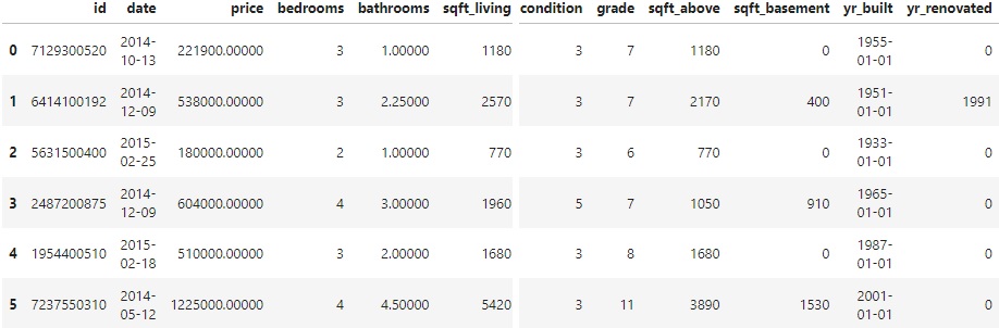
df.head(10)
Then we get a resume of the “ten” first rows. There is a lot of features that may have potential to influence on the houses price.
It’s also important to analyse statistical data and get an idea about the types of our features:
pd.DataFrame(df['price'].describe())

	        price
count	21613.00000
mean	540088.14177
std	    367127.19648
min	    75000.00000
25%	    321950.00000
50%	    450000.00000
75%	    645000.00000
max	    7700000.0000
df.info()
RangeIndex: 21613 entries, 0 to 21612
Data columns (total 21 columns):
 #   Column         Non-Null Count  Dtype
---  ------         --------------  -----
 0   id             21613 non-null  int64
 1   date           21613 non-null  datetime64[ns]
 2   price          21613 non-null  float64
 3   bedrooms       21613 non-null  int64
 4   bathrooms      21613 non-null  float64
 5   sqft_living    21613 non-null  int64
 6   sqft_lot       21613 non-null  int64
 7   floors         21613 non-null  float64
 8   waterfront     21613 non-null  int64
 9   view           21613 non-null  int64
 10  condition      21613 non-null  int64
 11  grade          21613 non-null  int64
 12  sqft_above     21613 non-null  int64
 13  sqft_basement  21613 non-null  int64
 14  yr_built       21613 non-null  datetime64[ns]
 15  yr_renovated   21613 non-null  int64
 16  zipcode        21613 non-null  int64
 17  lat            21613 non-null  float64
 18  long           21613 non-null  float64
 19  sqft_living15  21613 non-null  int64
 20  sqft_lot15     21613 non-null  int64
dtypes: datetime64[ns](2), float64(5), int64(14)
memory usage: 3.5 MB
dt = datetime assign() method assign new columns to a DataFrame, returning a new object (a copy) with the new columns added to the original ones. So, I just selected the data about the year and put in a new column and deleted the previous column that also had day and month.
df = df.assign(year_built=df.yr_built.dt.year)
df.drop('yr_built', 1, inplace=True)
We can check the output variable:
pd.DataFrame(raw_data['price'].describe())
	price
count	21613.00000
mean	540088.14177
std	367127.19648
min	75000.00000
25%	321950.00000
50%	450000.00000
75%	645000.00000
max	7700000.00000
Calling plot libs (sns and plt) and ajust its parameters according to the graph we want to make.
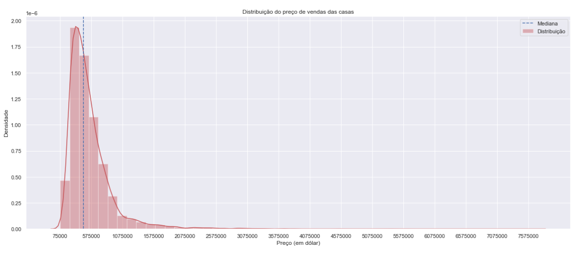
med_price = df['price'].median()

plt.figure(figsize=[20, 8])
sns.distplot(df['price'], color = 'r', label = 'Distribuição')
plt.axvline(med_price, color='b', linestyle='dashed', label='Mediana') #dashed median
plt.title('Distribuição do preço de vendas das casas')
plt.xlabel('Preço (em dólar)')
plt.ylabel('Densidade')
plt.ticklabel_format(style='plain', axis='x') #plain turns off scientific notation
plt.xticks(np.arange(df['price'].min(), df['price'].max(), step=500000)) #create an array containing a sequence of uniformed spaced values

plt.legend()
plt.show()
There is a very high standard deviation, it’s usually response to the presence of several outliers:
To check if there is null values on out set:
df.isnull().sum().sort_values(ascending=False)
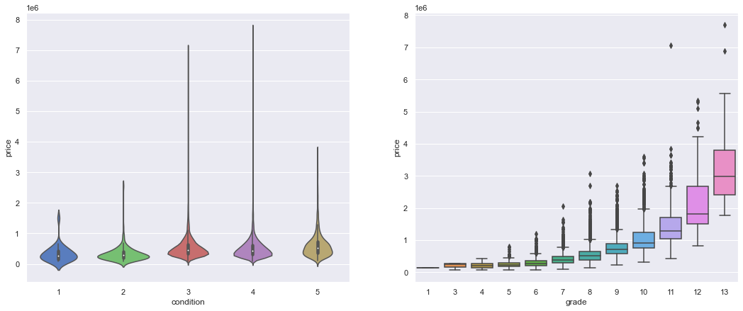
Checking the features one by one is also a good approach to identify important correlations:
plt.figure(figsize=[18, 7])

plt.subplot(121)
sns.violinplot(x='condition', y='price', data=df);

plt.subplot(122)
sns.boxplot(x='grade', y='price', data=df);

plt.show()
The grade feature seems to have a positive influence on houses price. There are several outliers, but the median price increases with the material quality.
plt.figure(figsize=[20, 6])
plt.subplot(122)
sns.barplot(x='bedrooms', y='price', data=df)
plt.show()
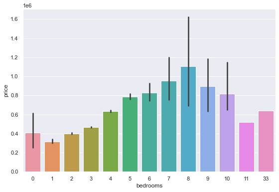
The number of rooms, when above 8, does not show too much correlation with the prices.
By commom sense we would think bedroom is an atribute that usually follows the properties price, but it is not very wise to count on this, because you take the risk of getting biased results.
pd.DataFrame(df['condition'].value_counts().sort_index())

condition
1	30
2	172
3	14031
4	5679
5	1701
There is few houses in bad conditions (1, 2), a high amount in average condition (3), a considerable amount in good conditions (4) and a lesser amount in great conditions (5).
pd.DataFrame(df['grade'].value_counts().sort_index())

	grade
1	1
3	3
4	29
5	242
6	2038
7	8981
8	6068
9	2615
10	1134
11	399
12	90
13	13
The grade increases untill 7, then keep decaying.
Data Munging
By now, we can see that there is a few features that may have low influence on the price sale, so we can drop them for our next analisys.
var_num = df._get_numeric_data()
var_num.drop('id', 1, inplace=True)
var_num.drop('view', 1, inplace=True)
var_num.drop('waterfront', 1, inplace=True)
Another way is calling just the features that I want in a new variable.
new_df = df[['price','grade','sqft_above',
       "sqft_living","sqft_living15","bathrooms"]]

new_df.head(10)

price		  grade	sqft_above	sqft_living	 sqft_living15	  bathrooms
221900.00000	7	  1180			1180		1340			1.00000
538000.00000	7	  2170			2570		1690			2.25000
180000.00000	6	   770			 770		2720			1.00000
604000.00000	7	  1050			1960		1360			3.00000
510000.00000	8	  1680			1680		1800			2.00000
1225000.0000	11	 3890			5420		4760			4.50000
257500.00000	7	  1715			1715		2238			2.25000
291850.00000	7	  1060			1060		1650			1.50000
229500.00000	7	  1050			1780		1780			1.00000
323000.00000	7	  1890			1890		2390			2.50000
We can call .corr() to find correlations between our features.
var_num.corr()
var_num_corr = var_num.corr()

plt.figure(figsize = [12, 8])
sns.heatmap(var_num_corr, vmin=-1, vmax=1, linewidth=0.01, linecolor='black', cmap='YlGnBu')
plt.show()
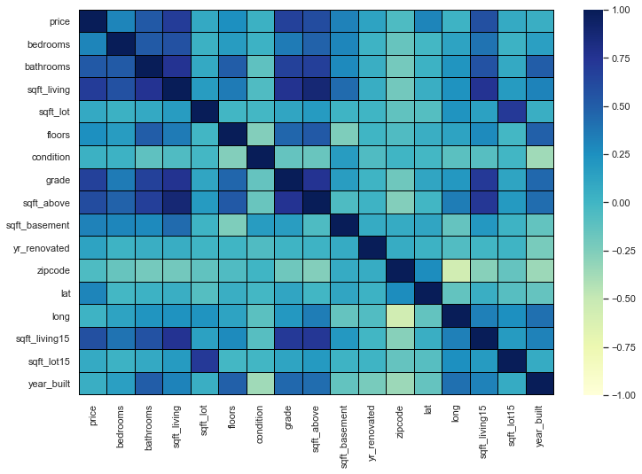
Correlating the other features with respect to the price and ranking them.
var_num_corr['price'].sort_values(ascending=False).round(3)

price            1.00000
sqft_living      0.70200
grade            0.66700
sqft_above       0.60600
sqft_living15    0.58500
bathrooms        0.52500
sqft_basement    0.32400
bedrooms         0.30800
lat              0.30700
floors           0.25700
yr_renovated     0.12600
sqft_lot         0.09000
sqft_lot15       0.08200
year_built       0.05400
condition        0.03600
long             0.02200
zipcode         -0.05300
Name: price, dtype: float64
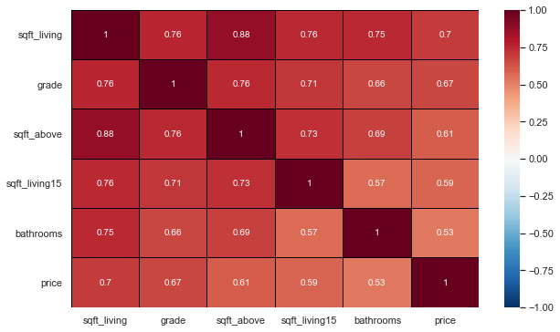
Selecting the most interesting features and doing a new correlation.
new_df = df[['sqft_living', 'grade', 'sqft_above',
       'sqft_living15', 'bathrooms','price']]
most_corr_var = new_df.corr()

plt.figure(figsize=[10, 6])
sns.heatmap(data=most_corr_var, vmin=-1, vmax=1, linewidth=0.01, linecolor='black', cmap='RdBu_r', annot=True)
#annot=True (If True, write the data value in each cell)

plt.show()
A loop is usually a good way to plot a diverse amount of features in a variable.
plt.figure(figsize=[15, 15])
custom_params = {"axes.spines.right": False, "axes.spines.top": False}
sns.set_theme(style="ticks", rc=custom_params)

i = 1

for col in new_df:
    if col == 'price':
        continue
    plt.subplot(4, 2, i)
    sns.regplot(x=new_df[col], y=new_df['price'], line_kws={'color': 'b'},#plot with specifying the x, y parameters
               color="lightseagreen", x_jitter=2.2, scatter_kws={'alpha':0.15})
    plt.xlabel(col)
    plt.ylabel('Preço de venda ($)')
    i+=1

plt.tight_layout()
plt.show()
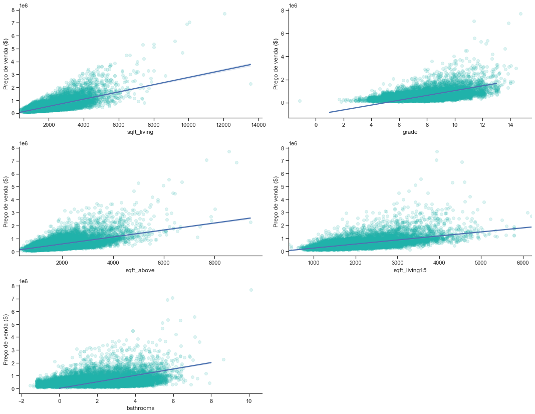
-
The number of bathrooms has a direct positive influence on the price, although there is a lot of dispersion of data since 5 bathrooms;
-
Sqlft_living also has a direct influence, despite the large dispersion from 7000 onwards;
-
As we expected, “grade” also has a positive influence; sqft_above and sqft_living15 have a positive influence, despite both having dispersion from 5000 onwards.
Analyzing the yr_build table.
Separating the years of construction into decades and creating a new column
dates = pd.DataFrame(df['year_built'], columns=['year_built'])
bins = [1900, 1910, 1920, 1930, 1940, 1950, 1960, 1970, 1980, 1990, 2000, 2010, 2015]
labels = ['1900 - 1910', '1911 - 1920', '1921 - 1930', '1931 - 1940', '1941 - 1950', '1951 - 1960', '1961 - 1970', '1971 - 1980',
         '1981 - 1990', '1991 - 2000', '2001 - 2010', '2011 - 2015']
df['decade_built'] = pd.cut(dates['year_built'], bins, labels = labels, include_lowest = True)
df.sample(5)
plt.figure(figsize=[12, 8])

sns.barplot(x=df['price'], y=df['decade_built'], palette="icefire",linewidth=1.5)

plt.show()
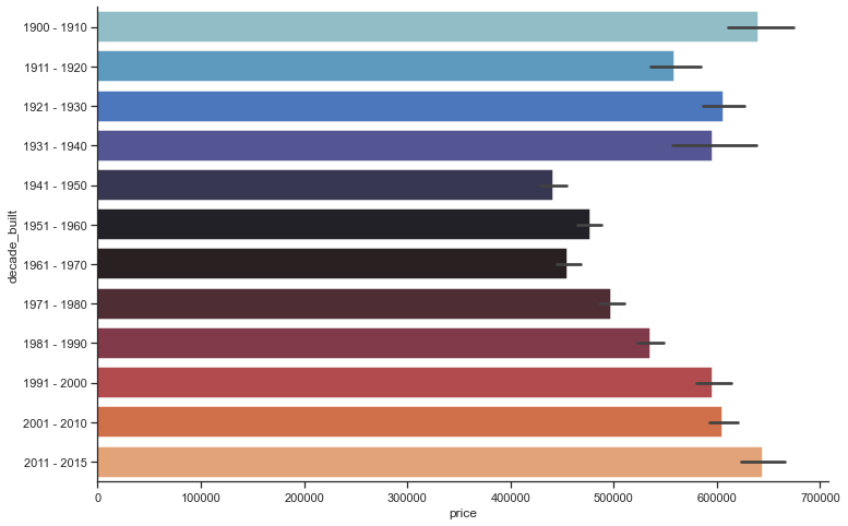
After a fluctuation of ups and downs between the years 1900 and 1970, houses price rised again from the year 1971 onwards.
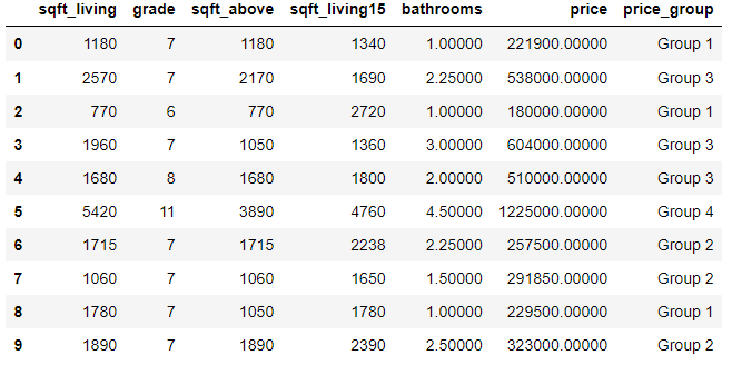
It is also interesting cluster the prices.
prices = pd.DataFrame(new_df['price'], columns=['price'])
bins = [0, 250000, 500000, 1000000, 8000000]
labels = ['Group 1', 'Group 2', 'Group 3', 'Group 4']
new_df['price_group'] = pd.cut(prices['price'], bins, labels = labels, include_lowest = True)
new_df.head(10)

Group 1:  0 a 250000
Group 2: 250001 a 500000
Group 3:  500001 a 1000000
Group 4: above 1000001
new_df.groupby('price_group')['price_group'].count()

price_group
Group 1     2433
Group 2    10127
Group 3     7588
Group 4     1465
Name: price_group, dtype: int64
The vast majority of sales are in groups 2 and 3, that indicates the price range varies between 250 thousand dollars and 1 million.
Another analysis can be made about the “yr_renovated” feature.
raw_data = raw_data.assign(renovated=(raw_data['yr_renovated'] > 0).astype(int))
#creating the assumption into the boolean (0 or year).

renovated = raw_data.groupby('renovated')['price'].count()
renovated

renovated
0    20699
1      914
Name: price, dtype: int64

renovated_median = raw_data.groupby('renovated')['price'].median()
renovated_median

renovated
0   448000.00000
1   600000.00000
Name: price, dtype: float64


plt.figure(figsize=(15, 5))

plt.subplot(1, 2, 1)
plt.pie(renovated, explode = (0, 0.1), colors=['g', 'cyan'], labels= ['Não', 'Sim'], autopct='%4.1f%%')
plt.title('A casa foi renovada ou não?')

plt.subplot(1, 2, 2)
sns.barplot(x=renovated.index, y = renovated_median, palette=['r', 'lightblue'])
plt.title('Mediana dos preços das casas renovadas ou não')
plt.ylabel('Mediana de preço')

plt.tight_layout()
plt.show()
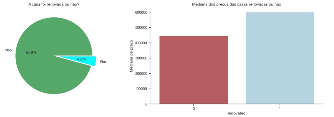
Renovated houses coust more, but few houses were renovated.
Once the data munging and analysis were done, we can get some idea about how is the influence of some features, and is enough to answer some earlyer questions, can you? By now, we can also begin to make more statystical analysis
-
Implementing Linear Regression to Predict R²: The R-squared is a statistical measure of how close the data is to the fitted regression line.
-
Key limitationr of R-Square: R-square cannot determine if the coefficient balance and predictions are biased, which is why you should evaluate residual plots.
-
The R-squared does not indicate whether a regression model is adequate. It is possible to have a low R-squared value for a good model or a high R-squared value for a model that doesn’t fit the data.
Importing some necessary libs like plt and sklearn.
import sklearn as sk
import matplotlib.pyplot as plt
from sklearn.linear_model import LinearRegression
Fit a linear regression model using the longitude feature ‘long’ and calculate the R².
X = df[['long']]
Y = df['price']
lm = LinearRegression()
lm
lm.fit(X,Y)
lm.score(X, Y)

0.00046769430149007363
Fit a linear regression model using the feature ‘sqft_living’ and calculate the R².
U = df[['sqft_living']]
V = df['price']
lm.fit(U,V)
lm.score(U,V)

0.4928532179037931
Fit a linear regression model using a variable list.
Why a Simple Linear Regression?
We need to solve a regression problem since my answer variable is numerical (Price).
features =["floors", "waterfront","lat" ,"bedrooms" ,"sqft_basement" ,"view" ,"bathrooms","sqft_living15","sqft_above","grade","sqft_living"]
X = df[features]
Y = df['price']
lm.fit(X,Y)

LinearRegression(copy_X=True, fit_intercept=True, n_jobs=None,
         normalize=False)
lm.score(X,Y)

0.6577151058279325
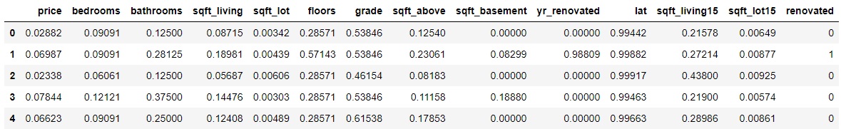
Model Evaluation and Refinement
Through the Min/MaxScaler we can put our features in the same scale.
from sklearn.preprocessing import MinMaxScaler
scaler = MinMaxScaler()
df = scaler.fit_transform(df)

df.drop(['date','zipcode','long','condition','year_built','decade_built','waterfront','view','id'], axis=1, inplace=True)

df['price'] = df['price'] / df['price'].max()
df['bedrooms'] = df['bedrooms'] / df['bedrooms'].max()
df['bathrooms'] = df['bathrooms'] / df['bathrooms'].max()
df['sqft_living'] = df['sqft_living'] / df['sqft_living'].max()
df['sqft_lot'] = df['sqft_lot'] / df['sqft_lot'].max()
df['floors'] = df['floors'] / df['floors'].max()
df['grade'] = df['grade'] / df['grade'].max()
df['sqft_above'] = df['sqft_above'] / df['sqft_above'].max()
df['sqft_basement'] = df['sqft_basement'] / df['sqft_basement'].max()
df['yr_renovated'] = df['yr_renovated'] / df['yr_renovated'].max()
df['lat'] = df['lat'] / df['lat'].max()
df['sqft_living15'] = df['sqft_living15'] / df['sqft_living15'].max()
df['sqft_lot15'] = df['sqft_lot15'] / df['sqft_lot15'].max()

df.head()
Linear Regression on then fully treated dataframe.
X = df.drop('price', axis=1)
y = df['price']
lm.fit(X,y)

LinearRegression(copy_X=True, fit_intercept=True, n_jobs=None,
         normalize=False)
lm.score(X,y)

0.6630336851239078
Test/Train A
df1 = pd.read_csv("kc_house_data.csv") #testing on the raw df

#features
x_train = df1.drop(["price","date"], axis=1)

#response variable
y_train = df1["price"].copy()
Model Training
#model description,
model_lr = LinearRegression()

#model training
model_lr.fit(x_train, y_train)
Performance Metrics
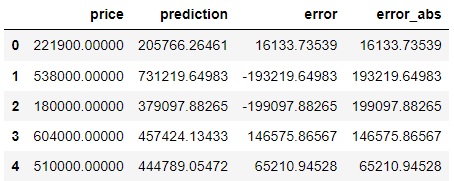
#prediction
pred = model_lr.predict(x_train)
df1['prediction'] = pred
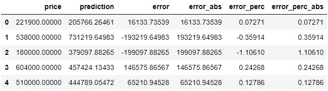
df1[["price","prediction"]].head()
price prediction
0 221900.00000 205766.26461
1 538000.00000 731219.64983
2 180000.00000 379097.88265
3 604000.00000 457424.13433
4 510000.00000 444789.05472
How much is my model missing? What is the difference between the actual value and the value that my model predicted?
#Prediction < Actual Price = Underestimation
#Prediction > Actual Price = Overestimation

df1["error"] = df1["price"] -df1["prediction"]
df1["error_abs"] = np.abs(df1["error"])
df1[["price","prediction","error","error_abs"]].head()
mae = np.mean(df1["error_abs"]) #error mean
print("MAE: {}".format(mae))
MAE: 125921.54419397262

df1["error_perc"] = ((df1["price"]-df1['prediction'])/df1['price']) #error percentual
df1[["price","prediction","error","error_abs","error_perc"]]

#to resume the percentual in a single value
df1["error_perc_abs"]= np.abs(df1["error_perc"])
df1[["price","prediction","error","error_abs","error_perc","error_perc_abs"]].head()
#mean absolute percentage error
mape = np.mean(df1["error_perc_abs"]) #my prediction error rate 25%
print("MAPE: {}".format(mape))
MAPE: 0.2558051253618308
Test/Train B
#Splitted Data
from sklearn.model_selection import train_test_split

X_train, X_test, y_train, y_test = train_test_split(X, y, test_size=0.33, random_state=44, shuffle =True)

print("number of test samples:", X_test.shape[0])
print("number of training samples:",X_train.shape[0])

number of test samples: 7133
number of training samples: 14480
- Ridge Linear Regression Model
from sklearn.linear_model import Ridge

RidgeModel = Ridge(alpha = 0.1)
RidgeModel.fit(X_train, y_train) #treinar modelo
print("The predicted values are : " + str(RidgeModel.predict(X_test)))

print("\nThe R^2 Score value is mentioned as : " + str(RidgeModel.score(X_test, y_test)))

The predicted values are : [0.05122976 0.05334605 0.05406578 ... 0.03066274 0.05512876 0.06664502]

The R^2 Score value is mentioned as : 0.6416574473478416
- Gradient Boosting Regression Model
from sklearn.ensemble import GradientBoostingRegressor

GBRModel = GradientBoostingRegressor(n_estimators=100,max_depth=2,learning_rate = 1.5 ,random_state=33)
GBRModel.fit(X_train, y_train)

print('GBRModel Train Score is : ' , GBRModel.score(X_train, y_train))
print('GBRModel Test Score is : ' , GBRModel.score(X_test, y_test))
print('----------------------------------------------------')

#Calculating Prediction
y_pred = GBRModel.predict(X_test)
print('Predicted Value for GBRModel is : ' , y_pred[:10])

from sklearn.metrics import mean_absolute_error

#Calculating Mean Absolute Error
MAEValue = mean_absolute_error(y_test, y_pred, multioutput='uniform_average') # it can be raw_values
print('\nMean Absolute Error Value is : ', MAEValue)

GBRModel Train Score is :  0.8375154821860198
GBRModel Test Score is :  0.6081972695779214
----------------------------------------------------
Predicted Value for GBRModel is :  [0.05112803 0.02610758 0.05654433 0.16174271 0.03812145 0.05084646
 0.08211293 0.04510831 0.03947703 0.08572436]

Mean Absolute Error Value is :  0.015095112550215718
- KNeighbors regression
from sklearn.neighbors import KNeighborsRegressor

KNeighborsRegressorModel = KNeighborsRegressor(n_neighbors = 5, weights='uniform', #also can be : distance, or defined function
                                               algorithm = 'auto')    #also can be : ball_tree ,  kd_tree  , brute
KNeighborsRegressorModel.fit(X_train, y_train)

#Calculating Details
print('KNeighborsRegressorModel Train Score is : ' , KNeighborsRegressorModel.score(X_train, y_train))
print('KNeighborsRegressorModel Test Score is : ' , KNeighborsRegressorModel.score(X_test, y_test))
#print('----------------------------------------------------')

#Calculating Prediction
y_pred = KNeighborsRegressorModel.predict(X_test)
print('\nPredicted Value for KNeighborsRegressorModel is : ' , y_pred[:10])

#Calculating Mean Absolute Error
MAEValue = mean_absolute_error(y_test, y_pred, multioutput='uniform_average') # it can be raw_values
print('\nMean Absolute Error Value is : ', MAEValue)

KNeighborsRegressorModel Train Score is :  0.7593636317590736
KNeighborsRegressorModel Test Score is :  0.5804982804241052

Predicted Value for KNeighborsRegressorModel is :  [0.03997403 0.07077922 0.05701299 0.17306364 0.05361818 0.03761039
 0.07452857 0.06200073 0.09711688 0.05098571]

Mean Absolute Error Value is :  0.018657923221318144
And we finally arrived to the end of our tests. After analyzing our results, we can get to the conclusion if our data analysis process responded important answers and if the ML models were good. The next step would be to take your data to a dashboard and show it to the client/company.
If you have any doubt or corrections, please contact me 😉.